Thursday 25 September 2014

Mise-en-scene - Extension Task 2.

Image 1: -


Image 2:-


Image 3:-


In all three images, there are children shown but the way they are presented conveys three different genres. In the first image, cake is used as a prop to create humour. With all the mess, the viewers instantly know that the film is a comedy as comedic films' genre conventions are messes and disasters. These messes and disasters make the scene funnier and make the viewers laugh at a character's misfortune. High key lighting is used to make the kitchen setting of the scene more realistic and the actors' casual costumes also add to the naturalness. The actor's shocked facial expression also adds to the comedic aspect of the film as the shocked emotions seem very humourous in relation to his situation.

In the second image, the children are presented in a very dark and scary manner. Their dead-like makeup shows a huge contrast to their natural costumes which creates a creepy atmosphere. They all have the same 'dead' facial expression and are all doing the same action of putting their finger on their finger on their lips which also adds to the eerie atmosphere. The low key lighting used in the attic setting creates strong shadows of the children which make gives off a very ominous feeling. The projector shows a ghoulish image which is a genre convention for horror films.

In the third image, the actors' costumes are old, traditional, Korean clothing. From their costumes, the viewers can tell that the genre is historical. Their makeup is very minimal so the actors look keep their child-like innocence and look natural. The high key lighting used in the garden setting also emphasizes the naturalness of the scene and shows off their facial expressions.

The mise-en-scene of each image allows the viewers to decipher the genre of the film very easily. It also helps the viewer to understand what emotions they must feel in the particular films.


Mise-en-scene - Extension Task 1.


In this still image, there are several characters in the frame but these characters are distinctly separated, which shows binary opposition (Levi Strauss) as one side may be representing the heroes while the other side may represent the villains. The separation make it look like there are two different gangs in conflict which could be a genre convention of an action film. The setting is shown to be very old and unkempt, and looks like a typical abandoned warehouse. The settings create a dangerous atmosphere which make the viewers anticipate the events that will take place here. The dim, pale lighting makes the scene look very serious and also adds to the dangerous aura given off. The costumes that all the characters are wearing, are very dark which adds to the seriousness of the overall scene. The makeup used on the actor in the middle shows that he has been injured as we can see the blood and bruises. The actor's pained facial expressions confirm that he is hurt and is also proof that the characters in the scene are dangerous.

Thursday 18 September 2014

Mise-en-scene - Powerpoint tasks


Notes:

  • Mise-en-scene = visual information in the scene or frame
          Made up of .....1. Settings and props
                                   2. Costume, hair and makeup
                                   3.Facial expressions & body language
                                   4.Lighting and colour
                                   5. Positioning of characters/objects within the frame

  • Mise-en-scene has hidden meanings in films.


  TASK: What meanings/emotions do the following images convey?
                              
Image 1 :This image conveys love and passion
Image 2 : This image conveys hatred, insanity and rage

   TASK: What does the positioning in  the following images reveal about the characters/ film?

Image 1: The characters are revealed to be distant and awkward with each other. As the woman hasn crossed her arms and her legs, she looks quite annoyed whereas the man's position makes him look timid but apologetic.
Image 2: The characters are revealed to be strong and powerful. As they are both in the exact same attire in the exact positions, they also look very professional.

  TASK: What does mise-en-scene tell you about the location?

Image 1; The dim lighting creates a dark depressing scene. As the lighting is dim to match the fact that the room is lit by a few candles, we know that the time period the film was set in was long ago. As the light is shown closest to the prisoners, the audiences attention is brought to the prisoners.
Image 2: The costume used emphasizes the old time period and that the man on top of the pile of gold  is a pirate as he is wearing pirate styled clothing. The swords tell us that a big action scene is about to take place and as all the characters are coming towards the gold, luxurious treasure, the audience has an idea of a possible reason why the fight was going to start.
Image 3: The costume, once again, reminds us of the old time period the movie is set in. The expressions that the men have are confusion or maybe superiority as they are looking down at a small man in this scene

Film Poster Analysis - Parental Guidance


The composition of the poster seems to have two halves which may contrast the grandparents' and the parents' views and personalities. As the tagline states "here come the grandparents...There go the rules", we can tell that the movie is related to all the wacky and wild events that take place while the grandparents come to visit. The different fonts of the slogan also supports the idea of the different views that the parents and grandparents hold as the font above the parents is plain and simple whereas the font above the grandparents seems more like handwriting on the wall, which is something young children would do. The other drawings, mess and hand prints on the wall also emphasizes how out of hand, the children get after the grandparents come. 
I think the genre off the movie is comedy as the poster shows off many comedic aspects such as the two contrasting sides of calmness and madness. The different poses the family are in also connotes comedic aspects as the parents, the mother in particular, are standing in very strong, trustworthy stances whereas the grandfather, although standing happily with his wife, is holding onto his two grandsons, one hanging upside down in the air. The typography of the film title also lets the audience understand straight away, that the film is a comedy film.
The target audience of the film is probably all ages as it serves as a very humorous film for the whole family to watch. The poster makes the film seem lighthearted and funny which will be enjoyable for most people.

Advert Analysis - Mercedes


In this advert, the car is in low lighting which shows off the sleek, modern look of the car. The fact that the doors are shown to be open emphasizes the modernness of the car as the doors open differently than normal cars which shows connotations of the company, Mercedes, focusing on the future generation of cars and how they want to look forward to improving their cars for the benefit of the customers. The front shot of the car also highlights its polished outlook which captivates customers to buy the car.The composition of the advert is very basic and the colours used in the setting are very simple but this simpleness centers all the attention on the car. This may connote that Mercedes don't need any gimmicks to attract customers and their statement "people only look at an advertisement for 2.6 seconds" supports their confidence in attracting customers within those 2.6 seconds. The website given below the statement is smaller but is positioned under the statement so the important information can be clearly seen. The dominant reading (Stuart Hall) of the poster is modernness, boldness, refined and the future whereas the oppositional reading is that the car is aimed for the younger generation and is very complicated to function. Mercedes wants to show off their futuristic cars but want to show that the car can be for anyone, not a certain age range.


Monday 15 September 2014

Advert Analysis- Reebok


The colour scheme of the advert creates a dark atmosphere. The composition is very simple as it only has two pictures with text but the black colours have connotations of seriousness and power. The finger print photos in the background reflects the rebellious lifestyle that 50 Cent once led, which links in with his quotation.The quotation said by 50 Cent at the top right hand corner may be inspirational and show off 50 Cent's rebellious lifestyle. This life style is thought to be attractive by a large proportion of the younger generation which will bring  attention to Reebok's branded clothes and shoes. The slogan used "i am what i am" shows individuality and the rebellious theme that attracts many people.The size of the image used of 50 Cent is large and the type of shot is a close up, which displays dominance and power. 50 Cent is lit in low lighting and his pose is very serious which also supports the fact that he is shown as a strong figure, which is an image that Reebok would like to be associated with.The dominant reading (Stuart Hall) of the poster is strength, individuality and control whereas the oppositional reading is criminology, defiance and rebellion. Although Reebok do want to be associated with criminal and rebellious nature, they do not want yo be seen as a company purely for criminals.


Sunday 14 September 2014

Media Consumption

Newspapers:
I don't read newspapers as often as I should read newspapers but when I see a newspaper on the train, I have a brief look at the headlines or any story i find particularly interesting. The newspaper I probably read the most often would be "The Metro". I tend to completely avoid the sports section as I don't have much interest in it.Sometimes I read newspapers that my brings home but I never buy it myself.

Magazines:
As I don't have any interest in magazines, I don't buy or read them.

Television:
Since the majority of television programmes can be found on the internet, I don't usually watch TV. Some shows such as "X Factor" and "Britain's Got Talent", I watch with my family on the weekend but my TV consumption is roughly about 4 hours a week.

Radio:
I don't usually listen to the radio. When I'm in the car, sometimes I listen to "Capital FM" but that is very seldom.

Cinema:
The most recent film that I have watched in the cinema was "What If". I dont visit the cinema often as the majority of films I watch are online. When I go to the cinema, I usually go with my friends and we normally decide together on what we watch.

Internet:
I access the internet everyday and spend a lot of my free time on the internet. I use the internet mainly to go on social networking sites such as Facebook to talk to my friends or other sites such as You Tube and Hotmail. I often watch several television programmes online as well. Sometimes,I use the internet to help me complete my homework as I can find lots of information that I need on the internet.

Film Poster Analysis

As the poster shows many different futuristic machines, the film may be focused on them and how they may also be a threat to the world. The two characters shown on the poster gives us an idea of the cast and we also get to understand that the man is the main character due to the amount of space he takes up, compared to the woman, in the poster. The slogan at the top right of the poster “Man has made his match……now it’s his problem” suggests that there is an invention created by man that should not have been created as it is described as a problem.
I think the film belongs to the action genre as the poster shows a man carrying a gun which connotes danger and violence. The title of the movie, "Blade Runner" also implies some violence as a blade is a weapon associated with violence. The futuristic machines included in the movie also makes it science fiction.
I think the target audience is over 18s as there is an R rated sign at the bottom of the poster. Also since the gun shows that there will be violence, this makes the movie inappropriate for a younger audience. Also, the woman in the smoking and the man wielding a gun in the poster also makes the film unsuitable for children of a younger age.


As the poster shows different actors similar to the actors of different horror films, the film would probably be parodies of famous horror movies with comedic aspects as the film characters aren't presented in a scary form.
I think the genres are horror and comedy.The film, as the title states, is a "scary movie". Although the title says that it is scary, the review given, changes the viewer's perception of the film being a pure horror film as it describes it to be "absolutely hilarious", showing the film would have some comedy aspects to it. Also, the way the poster has been presented does not have any scary appearances which also supports the film being funny.
I think the target audience are for over 18s as there is an R rated sign on bottom of the poster.The target audience would would probably be those who like the horror and comedy aspects and feel the two genres can make an enjoyable film.


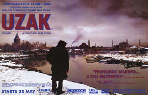
The poster shows a man looking at a dock on a cold bleak day. As there is not much going on in the poster, it is difficult to decipher what the film is about. The title of the film suggests that the film is a foreign film which does not help the audience find out what it is about. The setting shows that the film may be a sad, dramatic film as the setting is very dim and colourless.
I think the genre of the film is melodrama as the film looks like it will have many emotional scenes which may deeply affect the main character.The reviews given on the poster describing the movie to be "Profoundly Beautiful" emphasizes that the film will be emotional for the audience.
I think that the target audience for this film are adults as they will appreciate and fully understand the themes the film is trying to convey. I feel that a younger audience will have trouble connecting with the characters and may get bored from the serious, meaningful film.


This film may be centered on a young boy who faces his fears and confidently completes previous actions that he was once afraid to do. The poster shows the young boy looking at a hole in the ground. This hole may be what the film focuses on as it may be what the boy says he is not scared of.
 I think the genre might be adventure because the movie may be about the boy doing whatever it takes to  conquer his fears and be able to confidently say "I'm not scared".
I think the target audience would be for over 12s as they would be able to relate to the main character who is of a similar age to them and understand the importance of self-confidence and taking risks in life.


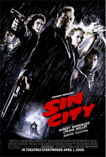
The film seems to be about a city where many people commit bad deeds and crimes, hence the name "Sin City". The poster introduces the main characters and what kind of images they will portray in the film. The black and red colours used in the poster emphasizes the dark setting of the movie and the numerous guns assures the viewers that it would be an action-packed film.
I think the genre of the movie is an action-thriller as the guns highlight the intense excitement that is yet to happen in the film. It also creates suspense and tension as the audience anticipates the many action scenes that will be involved in the film
I think the target audience may be over 18s as the guns show that there will be a lot of violence in the movie making it unsuitable for younger children.


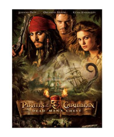
This movie seems to be about pirates who go on a difficult mission to retrieve the Dead Man's chest. The large tentacle coming out of the water connotes a dangerous journey that the main characters embark to complete their mission. The fir and the skull and cross bones puts further emphasis on the dangers that the main characters come across.
The genres of the film might be adventure as the poster shows ships sailing through rough seas and difficult obstacles. It may also be action because one of the characters in the poster seems to be holding a gun that implies the intense events that will take place.
The target audience of the film may be younger children from the age of about 10 and above as the world in which the film takes place is a fantasy world. Also, since it sees that the movie will be full of fast paced events, younger children would be able to keep up with the movie and thoroughly enjoy it. 


The film seems to be based on the famous book, Pride and Prejudice by Jane Austen as the name is very similar. Unlike the original book, this film seems to be taking place in India as the Taj Mahal is shown in the background of the poster. In one half on the poster, westernized characters are shown where as more traditional characters are shown in the other half. This may imply that there will be conflicts but as the atmosphere is very bright and warm, these conflicts might be solved quickly.
The genre of the film is probably romantic comedy as the two main characters look like they will have a budding romance in the film. I think that the different beliefs and ways of living will add to the comedic aspect, making the film more enjoyable.
I think the target audience for this film is all ages as there doesn't seem to be anything inappropriate or unsuitable for anyone. The film looks very fun and heart-warming for those of all ages to appreciate.


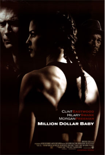
The film shows three characters in a dark, mysterious atmosphere. As the main actress is wearing, sports clothes, I think the film might be about a woman who succeeded as an athlete. The mysterious atmosphere may hint at the dark, unseen sides of athletes such as depression, drugs or other issues.
I think the genre might be drama because of the mood created by the colours used in the poster. All the characters also have very serious expressions on their faces which also supports the idea of this film being a drama. There is also a possibility that it could be a documentary about a female athlete trying to rise to fame and become well-known.
I think the audience this film would be available to is over 12s as there doesn't seem to be any inappropriate scenes for younger viewers but the film's target audience would be those of a higher age with some interests in the sports world as it may be slightly boring for those who do not have any interest in this field.


Sunday 7 September 2014

Why I Chose AS Media


I chose AS media studies as I feel that media is a very important aspect of everyone's day to day lives for communication, enjoyment and other purposes.

As my previous school did not offer media studies, I was not able to do it for GCSE, but as I had a strong interest in media and how the world relies heavily , I decided to choose it as one of my subjects. Although, a large work load is to be expected when taking media studies, it is one of the few subjects that allows you to be creative and imaginative, and I am greatly looking forward to that side of the subject.I also feel that media studies would assist me on to the majority of career paths as it has a very strong relevance to many professions.